Wednesday, 17 April 2024
Harnessing the Power of Data-Driven Bid Narratives
by Berkeley Lovelace

Generative AI has opened up a massive market for prospective bidders who could previously ill-afford to put their livelihoods on hold to respond to tender. This has all changed with an array of tools that help copmanies automate, synthesise, draft and manage the bidding process more efficiently and cost effectively than previous ways of working.
Being able to clearly differentate your offer, along with new human skills expected of today’s bid team will become the new normal. With the playing field of bidding being levelled and technology more mainstream, what are some new tricks that you can add to your bidding arsenal?
Bidding is getting more competitive, and therefore the ability to vividly demonstrate not just experience, but also the capacity to deliver on a contract, is paramount. Prospective clients on the procurement side are looking for compelling evidence that you can handle their needs effectively to reduce contract and delivery risk. One of the most persuasive ways to provide this assurance is through data-driven narratives.
Why use data in narratives?
Data serves as the backbone of credibility. When incorporated into your narrative, it tells a story that extends beyond mere words. This story isn’t just hypothesising about what you can do; it is showing – convincingly – what you have done and how well you can scale those achievements to meet new challenges. Graphs and charts have a unique advantage—they cut through the fluff. While narrative elements are certainly required for context, supportive visuals bring an immediate understanding of complex data.
Let’s delve into a more tangible instance — a case study of ‘resourcing and capacity’. Here, the use of data in your bid response can help you quickly convey not just that you have sufficient personnel, but that your staff distribution and expertise align precisely with the potential client’s needs.
Imagine presenting a cityscape of numbers: One office in one country has X full-time staff, Y part-time, and Z contractors. Multiply this data across several locations and you start to amass an unwieldy narrative that could easily lose the evaluator amidst a sea of figures. Now, picture this instead: A map adorned with proportional circles demonstrating staff distribution worldwide. Or a series of bar charts breaking down staff composition by employment type, specialty, and location. Each graphic is designed to offer immediate, accessible insight to an evaluator skimming through dozens of dense documents. This method doesn’t just articulate that your company has capacity—it quantitatively shows your readiness and good fit for the project.
Now, the golden question is: How do you embed powerful data visualisation into your narrative when you’re pressed for time and don’t have access to data scientists, Power BI analysts, or graphic designers?
AI Analysis in Bidding
AI tools are simplifying and speeding up the way we collate, analyse, and present data. Advanced natural language processing algorithms can sift through vast amounts of information to extract relevant data points. But the magic lies not just in linguistics, but in data visualisation AI tools. AI tools can transmute cold, hard data into appealing charts, graphs, and infographics with minimal user input. While the tech might be tad scrappy in the looks department, it’s functional (think of it like Excel before we had the luxury of design packages).
Here’s how AI tools can help when you’re up against time constraint:
Automated data analysis
AI tools can automatically analyse historical performance data, providing insights like trends in contract values, client diversity, project delivery times, budget adherence, and client satisfaction levels. By incorporating this analysis into your narrative, you can create a vivid picture of your proficiency and performance in handling similar contracts. If you have your data in a CSV file, you can upload this to your AI to run your analysis.
Instant visualisation
AI-powered data visualisation platforms can instantly create graphics that would take hours to design manually. These visuals can range from basic bar charts to intricate, multidimensional plots that offer deep insights at a glance.
To begin, you need:
- The title of the graph
- The categories for which you need the data plotted
- The values corresponding to each category (eg. vertical Y Axis)
- The timeline if it’s a time series graph (eg. horiztonal X Axis).
Minimal training required
With predefined reporting templates, your data in CSV format or just with AI prompting, AI data visualisation is now possible for someone to do without a data analytics degree or technical expertise to generate professional-quality graphics. Whilst the output may not be quite as polished (for now), the power really lies in the data and what it conveys to the reader (or evaluators).
Dynamic updating
When the underlying data updates, AI tools can refresh the associated visuals, ensuring your narrative is always rooted in the most current data, adding to its reliability.
Tailored messaging
New AI tools don’t just present data; they can also align visuals with strategic messaging. By inputting the narrative goals and client hot buttons, AI can recommend the most impactful way to visualise data in support of your message. You can then use these recommendations to craft your prompts.
Case study: Using AI analysis to visualise project capacity
Often it’s easier to ‘’show’’ with data than to write a long, wordy response, especially to help evaluators assess at a glance our financial and resource readiness. In this example we’ll take you through some approaches to demonstrate your capacity to deliver a project. In this scenario, let’s assume we’re bidding for a project that is scheduled to commence in the middle of next year.
Example 1: Create a pie chart to visualise project delivery capacity for mid-next year
To illustrate our financial capabilities, let’s prepare a pie chart with two segments: The percentage breakdown of Work Currently in Hand for 2025, and the percentgae Maximum Work Required for 2025. We would add supporting narrative to this pie chart to explain the figures. In our narrative we could explain the value of the work that we currently under contract. Then we would highlight our remaining financial capacity to undertake new projects, taking into account the value of the current tender.
We could take this further by demonstrating our financial capacity from both a total project and monthly cash flow perspective to take on new projects. We can explain what our forecasted revenue is per moonth to meet revenue targets for the year. We can then show monthly projections to show the level of revenue over time. As the chart shows, there is a drop off in monthly revenue based on current contracts, which demonstrates capacity (and a willingness) to take on new projects.
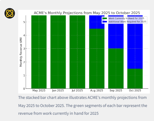
Note: Caption is truncated.
Example 2: Create a comparison bar chart to show distribution of staff across global operations.
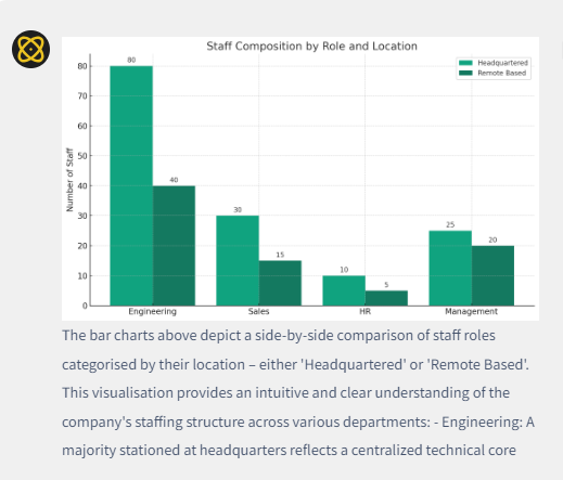
Note: Caption is truncated.
Example 3: Creating a horizontal bar chart to demonstrate current major project commitments.
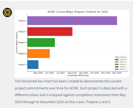
Note: Caption is truncated.
In this example we want to demonstrate the ability to provide adequate personnel resources to commence the project as required. In this example we have highlighted our project pipeline and the potential to move project personnel onto a new project as they come off other projects.
Tips for graph creation
Creating these graphical representations is straightforward when we break down the steps.
- Identify the data you need to visualise—financial figures, project timelines, etc.
- Choose the type of chart that best represents your data. For financial capacity, a pie chart might be suitable; for timelines and monthly revenue, bar charts work well.
- Use AI to assist with the generation of these charts. Provide clear and concise prompts that include the necessary information, such as the title, axes labels, and data points for each segment or bar. You can also suggest colours.
- Review the resulting graphs to ensure they correctly represent the data and are easy to understand.
- Embed the graphs within your content, making sure to provide supporting text that explains the visuals and highlights key points relevant to your audience.
To generate the graphs above we used simple prompts and Bidhive AI Assist to create these informative visuals. An easy way to come up with your prompt is to know what output you want, then write a brief narrative to ensure you are communicating what you want to see. Use this brief narrative as your prompt to guide the output. Keep tweaking until you find the prompts that work best for your scenario.
By following these steps, you, too, can showcase your organisation’s capabilities effectively in any operational scenario.
The learnings
As this case study demonstrates, no longer is access to sophisticated data visualisation the exclusive domain of large firms with dedicated departments. AI has democratised the ability to create compelling, data-driven narratives. Whether you’re a seasoned contractor or a challenger brand, AI tools can bolster your bid by showcasing your successes and projecting your capability in a persuasive, visually engaging format.
In the end, the potency of a data-driven narrative lies in its authenticity – the ability to tell a true story compellingly. With AI, you can tell such a story, even when time is of the essence.

The post Harnessing the Power of Data-Driven Bid Narratives appeared first on Bidhive.